project
Review your details
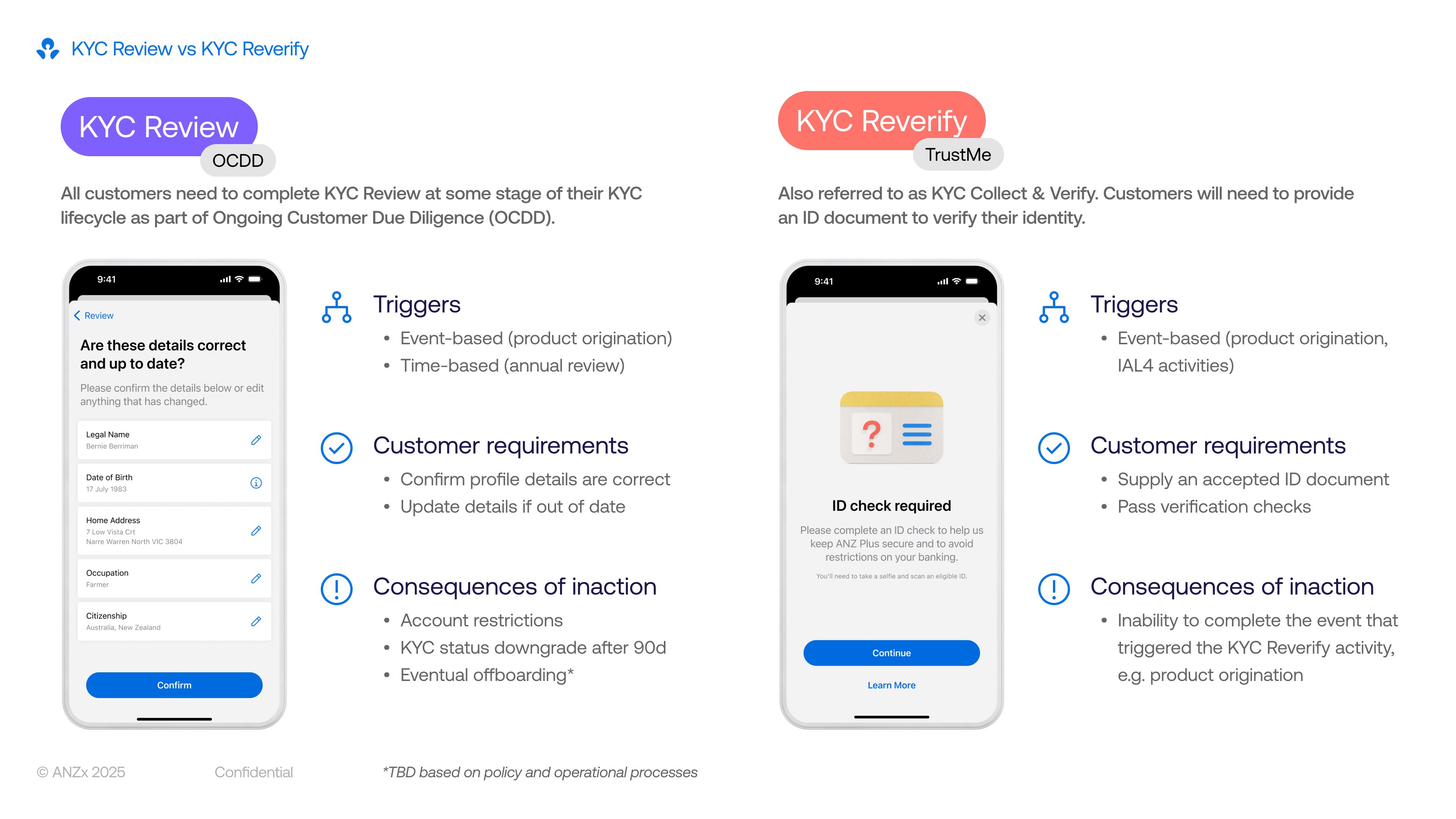
A proactive and automated KYC review experience to keep an up-to-date record of customers’ personal information.
project information

company
ANZ Plus
project date
October 2024 – April 2025
platform
iOS & Android
role
Product Designer (1/1)
tl;dr
design challenge
Create a flexible KYC engine to power a graduated escalation model to ensure customer data is kept up-to-date for Anti Money Laundering/Counter Terrorism Financing (AML/CTF) regulations.
business outcome
Staff required to complete KYC: 10 → 0 staff
Time to complete KYC: 5 → 1 minutes
solution
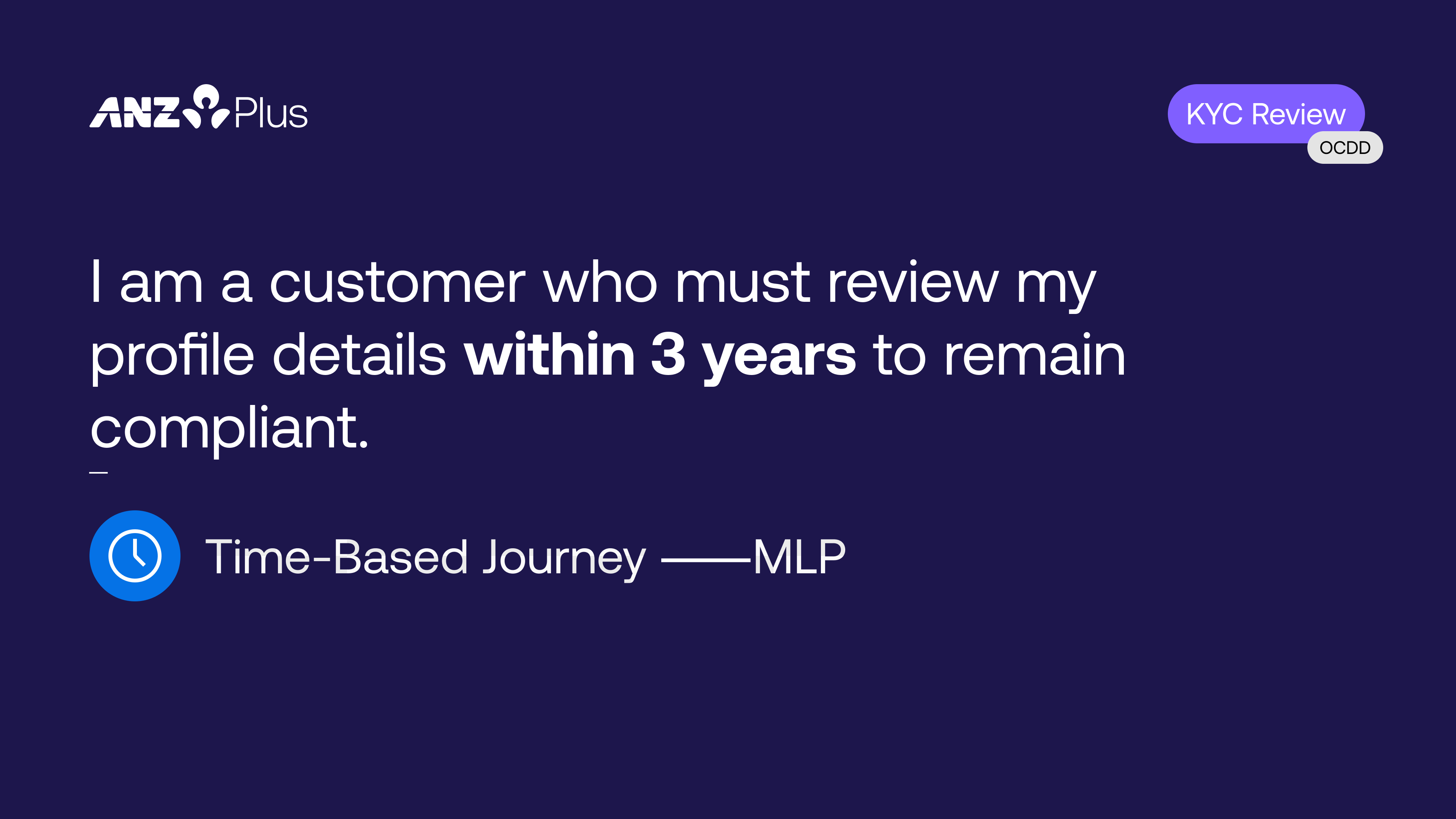
Review your details in the app every year (before it becomes a problem).
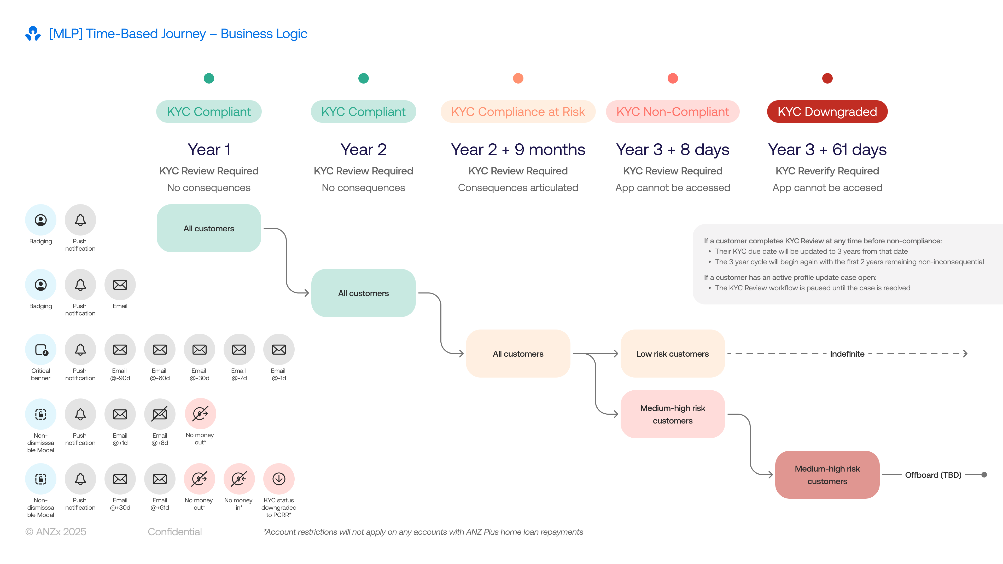
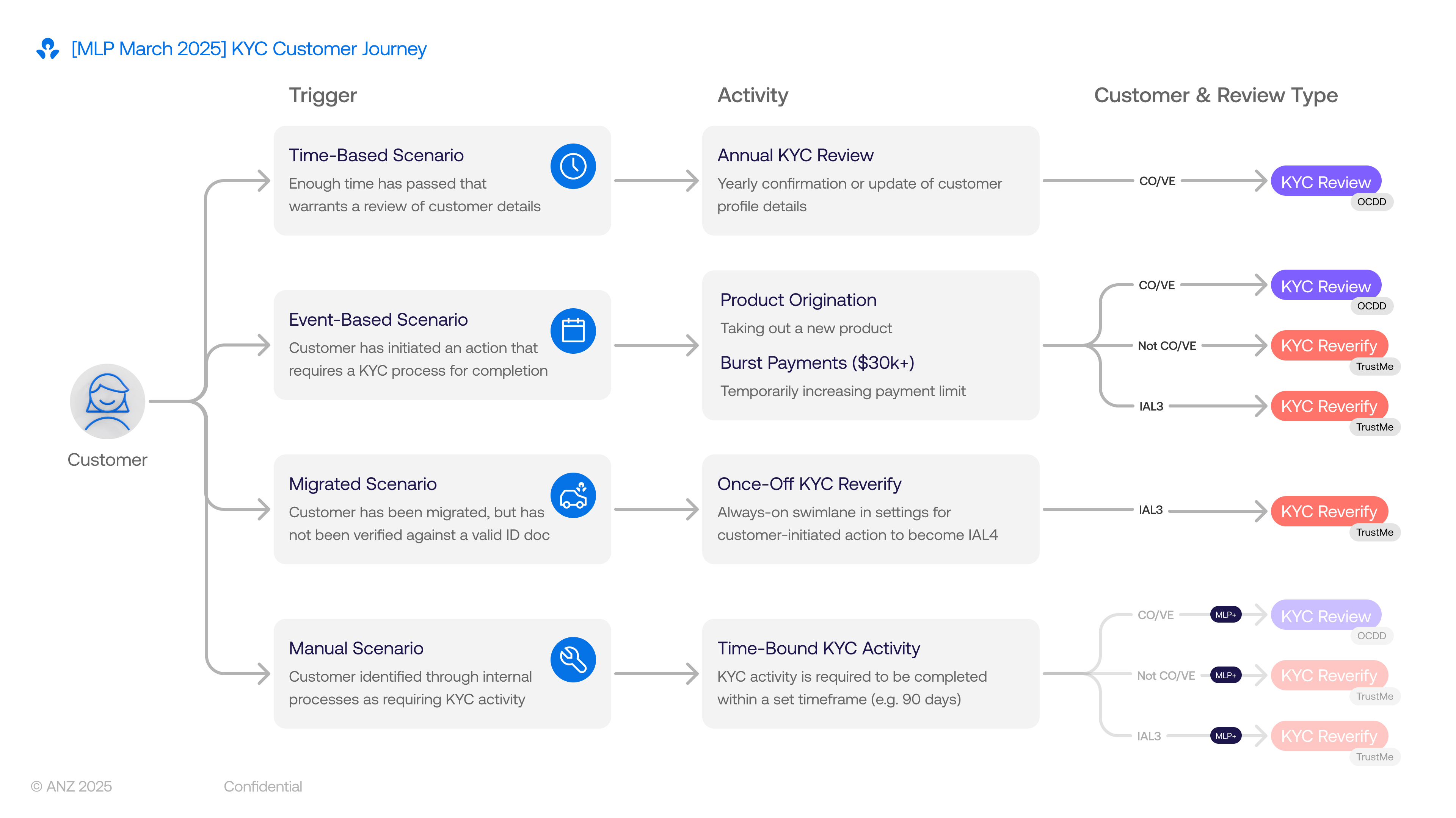
The interaction for a KYC review is simple; the real design challenge was creating a communication strategy that balanced regulatory pressure with a respectful customer experience. I advocated strongly for the customer voice, pushing back on a heavy-handed approach and instead designing a graduated escalation model over a three‑year deadline.
Rather than relying on easily ignored channels like email or push alone, we used in‑app UI patterns to signal urgency in a way that matched the customer’s risk and compliance status:
ui pattern
when
required action
A subtle badge on the Profile icon
The action is preferred but not yet required
Can be cleared by simply viewing the card, without forcing immediate KYC action
A non-dismissible banner on the home screen
The action is required but banking is still unaffected (pre-deadline)
Stays until the customer completes their KYC, keeping the task visible without blocking everyday use
A full-screen block of the app
Customer is non-compliant (deadline passed)
They must complete their KYC review before they can view their balance or make payments
For higher‑risk customers, we extended this pattern by restricting money in and out, aligning with risk requirements while making the consequences clear and predictable. This tiered approach turned a legal obligation into a clear, graduated experience that nudges customers early, explains impact, and only becomes truly disruptive when they repeatedly ignore critical updates.
A simple and clear question
1/5
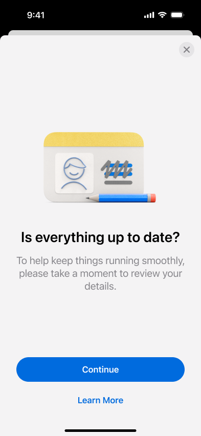
Research showed customers only completed KYC tasks when they understood why they were needed, so we led with a single, direct question: “Are these details still correct?” This set clear context upfront and increased task completion by making the purpose immediately obvious.
Biometrics to ensure you’re you
2/5
We required Selfie ID (a unique selfie per customer) before any detail changes to prevent unauthorised updates. Unlike device Face ID which allows multiple faces, our one‑selfie‑per‑customer model ensures only the verified account holder can make changes.

No changes, no worries
3/5
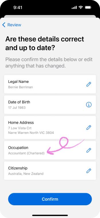
We display current details on file with a simple “All correct?” confirmation. No changes = one tap to complete, respecting customers’ time when their information hasn’t changed.
Simple change in-flow
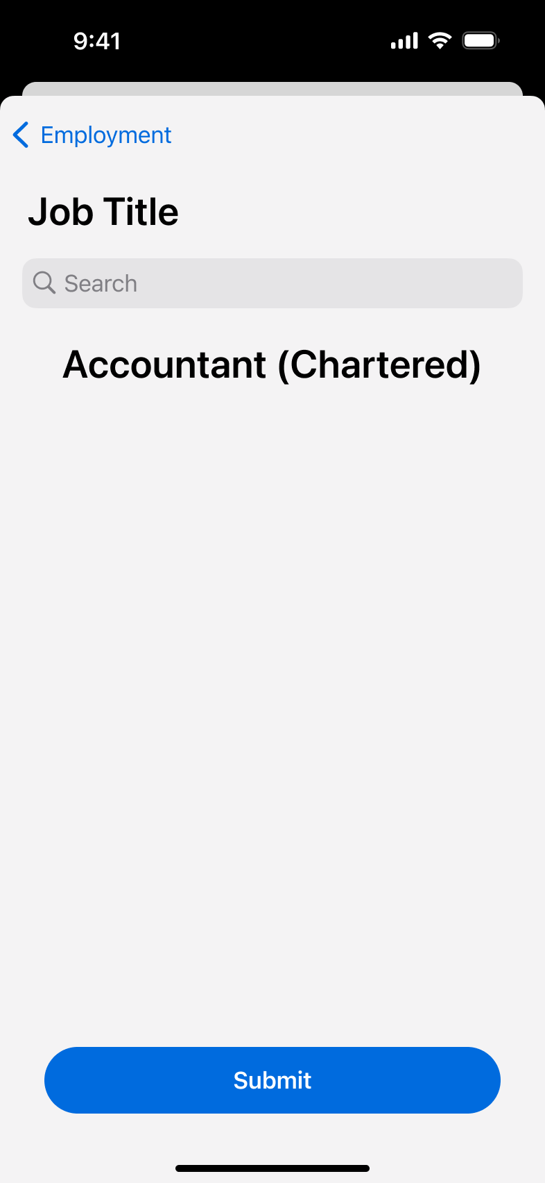
4/5
For straightforward updates like occupation or address, customers tap a pencil icon to edit inline without leaving the flow. This kept changes feeling quick and contained rather than sending them to a separate settings screen.
Complex changes require some time
5/5
Legal name changes need manual ID verification, so we show a banner and disable “Confirm” until a manual review is completed. This managed expectations clearly rather than letting customers think the app could instantly validate complex documents.
reflection
What I learnt from this.
First high-profile project with so many rules and regulationsMy debut high-profile project forced me to balance banking's ironclad AML/CTF rules with human-centred design. While compliance isn’t super exciting, the constraint of it is what makes UX fun – finding ways to make the regulations human, turning legal obligations into proactive customer nudges rather than forced blocks.
Design-led storytelling sways stakeholdersI led product and business teams in crafting a narrative that put customer voice first while ticking compliance boxes. In a legal-heavy space, I became the user advocate, translating "graduated escalation" from abstract policy into tangible flows (badge → banner → block) that built cross-team consensus.
Lookbook: Visual artefact > word-heavy slide decksI created a Lookbook distilling complex reasoning for why badges reduce friction and why banners build urgency, into a visually digestible story that could be understood by anyone. It became the alignment weapon, cutting through risk/legal jargon to secure buy-in where emails and meetings failed. Visual storytelling is now my go-to for technical audiences.
Work
Take a look at some of my other projects.

project
Open a joint account
see case study
project
Web login & authentication
see case study
project
Banking with your team

see case study
project
Review your details
A proactive and automated KYC review experience to keep an up-to-date record of customers’ personal information.
project information

company
ANZ Plus
project date
October 2024 – April 2025
platform
iOS & Android
role
Product Designer (1/1)
tl;dr

design challenge
Create a flexible KYC engine to power a graduated escalation model to ensure customer data is kept up-to-date for Anti Money Laundering/Counter Terrorism Financing (AML/CTF) regulations.
business outcome
Staff required to complete KYC: 10 → 0 staff
Time to complete KYC: 5 → 1 minutes
solution
Review your details in the app every year (before it becomes a problem).
The interaction for a KYC review is simple; the real design challenge was creating a communication strategy that balanced regulatory pressure with a respectful customer experience. I advocated strongly for the customer voice, pushing back on a heavy-handed approach and instead designing a graduated escalation model over a three‑year deadline.
Rather than relying on easily ignored channels like email or push alone, we used in‑app UI patterns to signal urgency in a way that matched the customer’s risk and compliance status:
ui pattern
when
required action
A subtle badge on the Profile icon
The action is preferred but not yet required
Can be cleared by simply viewing the card, without forcing immediate KYC action
A non-dismissible banner on the home screen
The action is required but banking is still unaffected (pre-deadline)
Stays until the customer completes their KYC, keeping the task visible without blocking everyday use
A full-screen block of the app
Customer is non-compliant (deadline passed)
They must complete their KYC review before they can view their balance or make payments
For higher‑risk customers, we extended this pattern by restricting money in and out, aligning with risk requirements while making the consequences clear and predictable. This tiered approach turned a legal obligation into a clear, graduated experience that nudges customers early, explains impact, and only becomes truly disruptive when they repeatedly ignore critical updates.
Biometrics to ensure you’re you
We required Selfie ID (a unique selfie per customer) before any detail changes to prevent unauthorised updates. Unlike device Face ID which allows multiple faces, our one‑selfie‑per‑customer model ensures only the verified account holder can make changes.
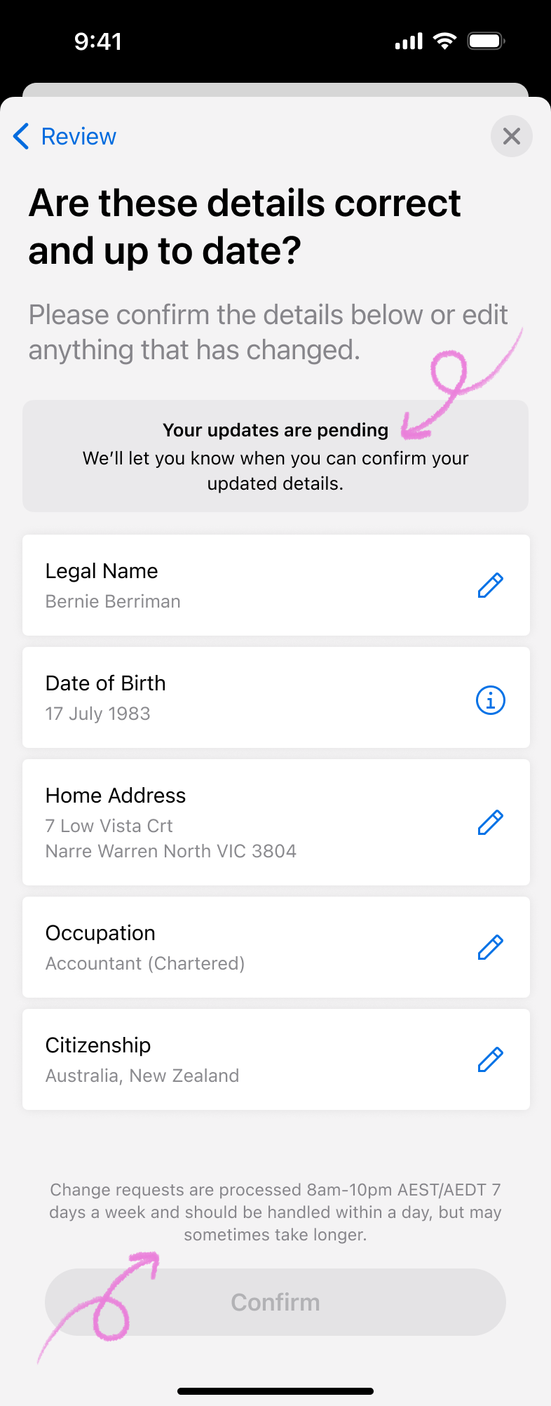
No changes, no worries
We display current details on file with a simple “All correct?” confirmation. No changes = one tap to complete, respecting customers’ time when their information hasn’t changed.
Simple change in-flow
4/5
For straightforward updates like occupation or address, customers tap a pencil icon to edit inline without leaving the flow. This kept changes feeling quick and contained rather than sending them to a separate settings screen.
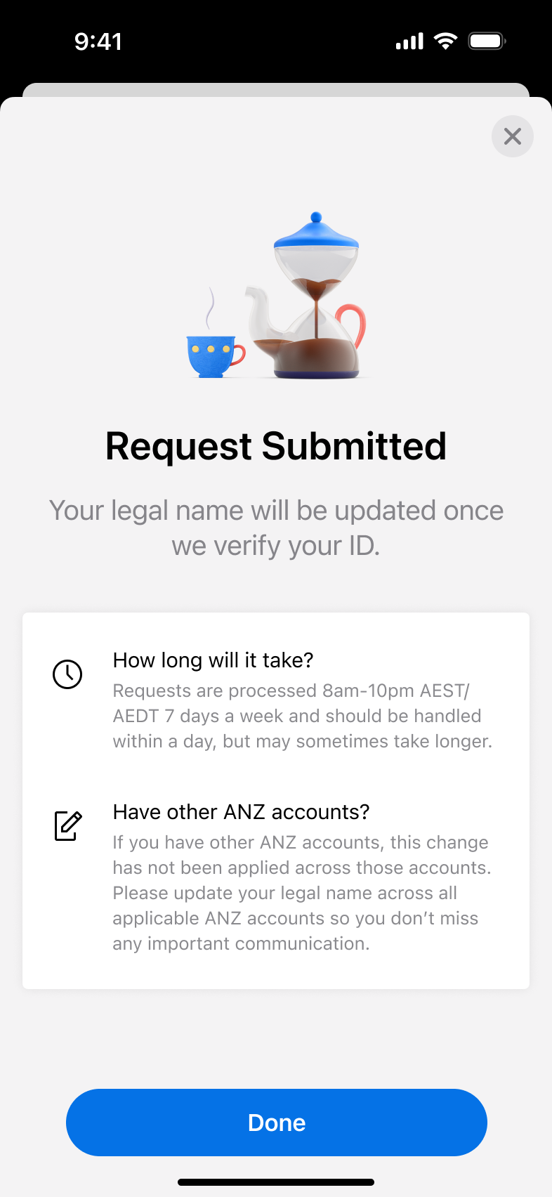
Complex changes require some time
5/5
Legal name changes need manual ID verification, so we show a banner and disable “Confirm” until a manual review is completed. This managed expectations clearly rather than letting customers think the app could instantly validate complex documents.
A simple and clear question
1/5
Research showed customers only completed KYC tasks when they understood why they were needed, so we led with a single, direct question: “Are these details still correct?” This set clear context upfront and increased task completion by making the purpose immediately obvious.
reflection
What I learnt from this.
First high-profile project with so many rules and regulationsMy debut high-profile project forced me to balance banking's ironclad AML/CTF rules with human-centred design. While compliance isn’t super exciting, the constraint of it is what makes UX fun – finding ways to make the regulations human, turning legal obligations into proactive customer nudges rather than forced blocks.
Design-led storytelling sways stakeholdersI led product and business teams in crafting a narrative that put customer voice first while ticking compliance boxes. In a legal-heavy space, I became the user advocate, translating "graduated escalation" from abstract policy into tangible flows (badge → banner → block) that built cross-team consensus.
Lookbook: Visual artefact > word-heavy slide decksI created a Lookbook distilling complex reasoning for why badges reduce friction and why banners build urgency, into a visually digestible story that could be understood by anyone. It became the alignment weapon, cutting through risk/legal jargon to secure buy-in where emails and meetings failed. Visual storytelling is now my go-to for technical audiences.
Work
Take a look at some of my other projects.
project
Open a joint account
see case study
project
Web login & authentication
see case study
project
Banking with your team
see case study
project
Review your details
A proactive and automated KYC review experience to keep an up-to-date record of customers’ personal information.
project information

company
ANZ Plus
project date
October 2024 – April 2025
platform
iOS & Android
role
Product Designer (1/1)
tl;dr

design challenge
Create a flexible KYC engine to power a graduated escalation model to ensure customer data is kept up-to-date for Anti Money Laundering/Counter Terrorism Financing (AML/CTF) regulations.
business outcome
Staff required to complete KYC: 10 → 0 staff
Time to complete KYC: 5 → 1 minutes
solution
Review your details in the app every year (before it becomes a problem).
The interaction for a KYC review is simple; the real design challenge was creating a communication strategy that balanced regulatory pressure with a respectful customer experience. I advocated strongly for the customer voice, pushing back on a heavy-handed approach and instead designing a graduated escalation model over a three‑year deadline.
Rather than relying on easily ignored channels like email or push alone, we used in‑app UI patterns to signal urgency in a way that matched the customer’s risk and compliance status:
ui pattern
when
required action
A subtle badge on the Profile icon
The action is preferred but not yet required
Can be cleared by simply viewing the card, without forcing immediate KYC action
A non-dismissible banner on the home screen
The action is required but banking is still unaffected (pre-deadline)
Stays until the customer completes their KYC, keeping the task visible without blocking everyday use
A full-screen block of the app
Customer is non-compliant (deadline passed)
They must complete their KYC review before they can view their balance or make payments
For higher‑risk customers, we extended this pattern by restricting money in and out, aligning with risk requirements while making the consequences clear and predictable. This tiered approach turned a legal obligation into a clear, graduated experience that nudges customers early, explains impact, and only becomes truly disruptive when they repeatedly ignore critical updates.
A simple and clear question
1/5
Research showed customers only completed KYC tasks when they understood why they were needed, so we led with a single, direct question: “Are these details still correct?” This set clear context upfront and increased task completion by making the purpose immediately obvious.
Biometrics to ensure you’re you
2/5
We required Selfie ID (a unique selfie per customer) before any detail changes to prevent unauthorised updates. Unlike device Face ID which allows multiple faces, our one‑selfie‑per‑customer model ensures only the verified account holder can make changes.
No changes, no worries
3/5
We display current details on file with a simple “All correct?” confirmation. No changes = one tap to complete, respecting customers’ time when their information hasn’t changed.
Simple change in-flow
4/5
For straightforward updates like occupation or address, customers tap a pencil icon to edit inline without leaving the flow. This kept changes feeling quick and contained rather than sending them to a separate settings screen.
Complex changes require some time
5/5
Legal name changes need manual ID verification, so we show a banner and disable “Confirm” until a manual review is completed. This managed expectations clearly rather than letting customers think the app could instantly validate complex documents.
reflection
What I learnt from this.
First high-profile project with so many rules and regulationsMy debut high-profile project forced me to balance banking's ironclad AML/CTF rules with human-centred design. While compliance isn’t super exciting, the constraint of it is what makes UX fun – finding ways to make the regulations human, turning legal obligations into proactive customer nudges rather than forced blocks.
Design-led storytelling sways stakeholdersI led product and business teams in crafting a narrative that put customer voice first while ticking compliance boxes. In a legal-heavy space, I became the user advocate, translating "graduated escalation" from abstract policy into tangible flows (badge → banner → block) that built cross-team consensus.
Lookbook: Visual artefact > word-heavy slide decksI created a Lookbook distilling complex reasoning for why badges reduce friction and why banners build urgency, into a visually digestible story that could be understood by anyone. It became the alignment weapon, cutting through risk/legal jargon to secure buy-in where emails and meetings failed. Visual storytelling is now my go-to for technical audiences.
Work
Take a look at some of my other projects.
project
Open a joint account
see case study
project
Web login & authentication
see case study
project
Banking with your team
see case study